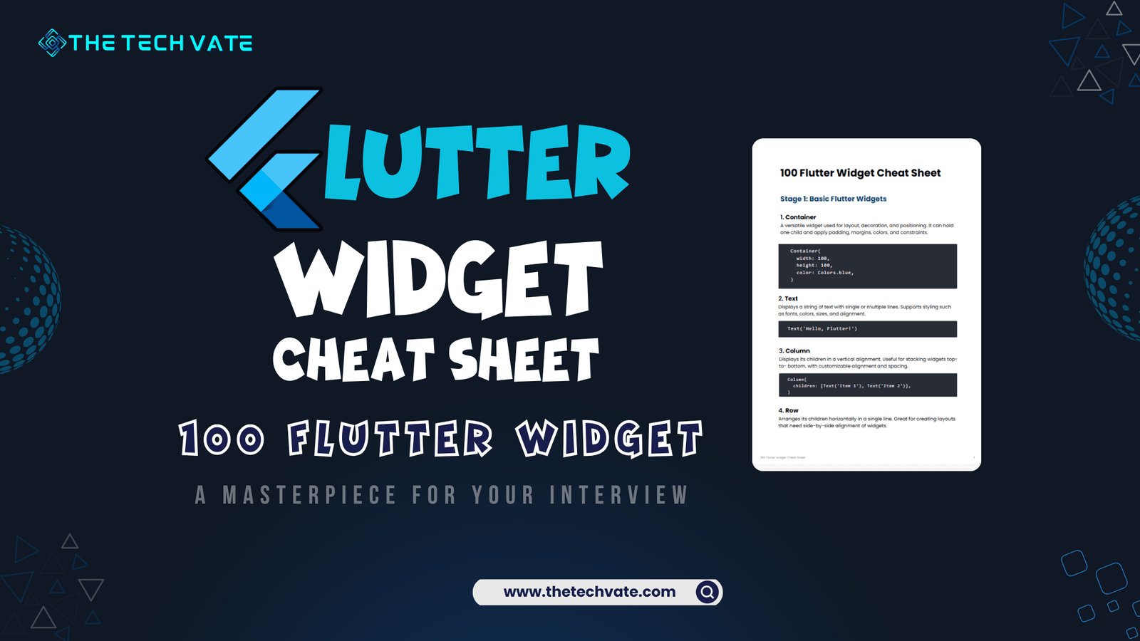
Welcome to the ultimate Flutter widget cheat sheet! In this article, I will share the Flutter widget cheat sheet that will help you remember Flutter’s basic essential widgets. It will enhance your Flutter development journey.
Jumping into Flutter is like focusing only on the hundreds of tools in the toolbox—every single one brings out the essential features of your application ideas. App structures can be fairly basic with widgets that allow displaying a single textual entity or more challenging, with complex animations and layouts, but any app developed in Flutter will always use its widgets.
When there are a variety of choices, many options can lead to confusion, especially if you are a beginner or have specific deliverables to complete within a certain timeframe, making this document relevant.
I made this 100 Flutter Widget Cheat Sheet—the complete fun guide—it’s very hands-on, easy to read, and covers everything from basic buttons and their placements to more complex elements, like advanced platform controls and animations. So, whether you are a novice or an expert, the aim is to lessen the effort and, in doing so, enhance your efficiency in finding the correct widget.
Table of Contents
Download Flutter Widget Cheat Sheet PDF
Download the Flutter Cheat Sheet PDF. Your support through a small purchase helps us continue creating quality resources
Stage 1: Basic Flutter Widgets
1. Container
A box model that allows you to customize properties like padding, margin, color, etc.
					Container(
  width: 100,
  height: 100,
  color: Colors.blue,
)
2. Text
Displays a string of text on the screen.
Text('Hello, Flutter!')
3. Column:
					Column(
  children: [
    Text('First item'),
    Text('Second item'),
  ],
)
4. Row:
A widget that sets up its children widgets horizontally. Unless you wrap it with a scrollable widget, scrolling is not possible.
					Row(
  children: [
    Text('First item'),
    Text('Second item'),
  ],
)
5. Center:
It is an align widget that centers its child widget and may adjust its own size in response to the child’s dimensions
					Center(
  child: Text('Hello, Flutter!'),
)
6. Padding
Adds padding around a child widget.
					Padding(
  padding: EdgeInsets.all(16.0),
  child: Text('Padded Text'),
)
7. SizedBox
Creates a box of a specific size.
					SizedBox(
  height: 50,
  width: 50,
)
8. Image
Displays an image from a source like assets or network.
Image.network('https://example.com/image.png')
9. Icon
Displays a graphical icon.
Icon(Icons.home, size: 50, color: Colors.red)
10. ElevatedButton
					ElevatedButton(
  onPressed: () {},
  child: Text('Elevated Button'),
)
11. TextButton
A button without elevation or borders.
					TextButton(
  onPressed: () {},
  child: Text('Text Button'),
)
12. OutlinedButton
A button with an outline and no elevation.
					OutlinedButton(
  onPressed: () {},
  child: Text('Outlined Button'),
)
13. Checkbox
A box that can be checked (true) or unchecked (false).
					Checkbox(
  value: true,
  onChanged: (newValue) {},
)
14. Switch
A toggle switch for selecting between on/off states.
					Switch(
  value: true,
  onChanged: (newValue) {},
)
15. Slider
Allows users to select a value from a range by sliding.
					Slider(
  value: 0.5,
  onChanged: (newValue) {},
)
16. ProgressIndicator
Displays a circular or linear progress bar.
CircularProgressIndicator()
17. AppBar
A material design app bar that can hold titles and actions.
					AppBar(
  title: Text('AppBar Title')
  )
18. Scaffold
Provides a basic framework for app structure like app bar, body, drawer, etc.
					Scaffold(
  appBar: AppBar(title: Text('My App')),
  body: Center(child: Text('Hello!')),
)
19. Divider
The Divider widget is used to draw a horizontal line between widgets, helping to separate content visually. It’s commonly used in lists or layouts to add spacing and clarity.
					Divider(
  color: Colors.grey,
  thickness: 2.0,
);
Stage 2: Layout and State Management Widgets
20. ListView
A scrollable list of widgets is displayed vertically.
					ListView(
  children: [Text('Item 1'), Text('Item 2')],
)
21. GridView
Displays widgets in a grid format, allowing scrolling.
					GridView.count(
  crossAxisCount: 2,
  children: [Icon(Icons.star), Icon(Icons.favorite)],
)
22. Stack
Overlays widgets on top of each other.
					Stack(
  children: [
    Container(
      width: 200,
      height: 200,
      color: Colors.blue,
    ),
    Positioned(
      top: 50,
      left: 50,
      child: Text('Hello'),
    ),
    Positioned(
      bottom: 50,
      right: 50,
      child: Text('Flutter'),
    ),
  ],
)
23. Positioned
Positions a widget within a Stack using coordinates.
					Positioned(
  left: 10,
  top: 20,
  child: Text('I am positioned!'),
)
24. Expanded
Expands a widget to fill available space within a flex container like Row or Column.
					Expanded(
  child: Text('I take all available space!'),
)
25. Flexible
A flexible widget that can expand or shrink based on available space, but with more control than Expanded.
					Flexible(
  child: Text('I am flexible!'),
)
26. Wrap
Displays widgets in a flow, wrapping to the next line if there’s no space.
					Wrap(
  children: [Text('Item 1'), Text('Item 2'), Text('Item 3')],
)
27. FittedBox
Scales and fits its child widget within the available space.
					FittedBox(
  child: Text('This text scales'),
  )
28. Align
Aligns a child widget within its parent according to specified alignment.
					Align(
  alignment: Alignment.centerRight,
  child: Text('Aligned Right'),
)
29. FractionallySizedBox
Sizes its child based on a fraction of its parent’s size.
					FractionallySizedBox(
  widthFactor: 0.5,
  child: Container(color: Colors.blue),
)
30. Table
Displays widgets in a table layout with rows and columns.
					Table(
  children: [
    TableRow(children: [Text('Row 1, Col 1'), Text('Row 1, Col 2')]),
    TableRow(children: [Text('Row 2, Col 1'), Text('Row 2, Col 2')]),
  ],
)
31. Form
A container for grouping and validating input fields.
					Form(
  child: TextFormField(decoration: InputDecoration(labelText: 'Enter text')),
)
32. TextField
A basic input field for entering text.
					TextField(
  decoration: InputDecoration(labelText: 'Enter your name'),
)
33. GestureDetector
Detects gestures like tap, drag, etc., and allows interaction with widgets.
					GestureDetector(
  onTap: () => print('Tapped!'),
  child: Container(color: Colors.green, width: 100, height: 100),
)
34. InkWell
A material design tap effect that wraps around any widget, making it tappable.
					InkWell(
  onTap: () => print('InkWell tapped'),
  child: Container(color: Colors.yellow, width: 100, height: 100),
)
35. Hero
Provides a shared element transition between screens.
					Hero(
  tag: 'hero-tag',
  child: Image.network('https://example.com/image.png'),
)
36. BottomNavigationBar
A bottom navigation bar for navigating between different views or pages.
					BottomNavigationBar(
  items: [
    BottomNavigationBarItem(icon: Icon(Icons.home), label: 'Home'),
    BottomNavigationBarItem(icon: Icon(Icons.person), label: 'Profile'),
  ],
)
37. TabBar
Displays tabs at the top of a screen for navigation.
					TabBar(
  tabs: [Tab(text: 'Tab 1'), Tab(text: 'Tab 2')],
)
38. TabBarView
A view that switches between different screens when tabs are clicked.
					TabBarView(
  children: [
  Center(child: Text('Tab 1 Content')),
  Center(child: Text('Tab 2 Content'))
  ],
)
39. Drawer
A slide-out menu that appears from the side of the screen.
					Drawer(
  child: ListView(children: [ListTile(title: Text('Item 1'))]),
)
Stage 3: Customization and Animation Widgets
40. AbsorbPointer
The AbsorbPointer widget prevents its child widget from receiving pointer events like taps and drags. It’s useful for temporarily disabling touch interaction on specific widgets.
					AbsorbPointer(
  absorbing: true,
  child: ElevatedButton(onPressed: () {}, child: Text('Button')),
);
41. AnimatedContainer
A container that transitions between values like size, color, etc., with animation.
					AnimatedContainer(
  duration: Duration(seconds: 1),
  width: 100,
  height: 100,
  color: Colors.blue,
)
42. AnimatedOpacity
Animates changes to the opacity of a widget.
					AnimatedOpacity(
  opacity: 0.5,
  duration: Duration(seconds: 1),
  child: Text('Fading Text'),
)
43. AnimatedBuilder
Builds a widget while animating its properties using an animation controller.
					AnimatedBuilder(
  animation: _controller,
  builder: (context, child) => Transform.rotate(
    angle: _controller.value * 6.3,
    child: child,
  ),
  child: Icon(Icons.star),
)
44. AnimatedSwitcher
Switches between two widgets with an animation when the state changes.
					AnimatedSwitcher(
  duration: Duration(seconds: 1),
  child: _isFirst ? Text('First') : Text('Second'),
)
45. AnimatedList
Displays a list with animated insertions and removals
					AnimatedList(
  initialItemCount: 3,
  itemBuilder: (context, index, animation) {
    return SizeTransition(
      sizeFactor: animation,
      child: Text('Item $index'),
    );
  },
)
46. PageView
A scrollable list of pages that the user can swipe between.
					PageView(
  children: [Text('Page 1'), Text('Page 2')],
)
47. ClipRRect
Clips its child widget with rounded corners.
					ClipRRect(
  borderRadius: BorderRadius.circular(8.0),
  child: Image.network('https://example.com/image.png'),
)
48. ClipOval
Clips its child into an oval shape.
					ClipOval(
  child: Image.network('https://example.com/image.png'),
)
49. ClipPath
Clips its child using a custom path.
					ClipPath(
  clipper: MyCustomClipper(),
  child: Container(color: Colors.red),
)
50. CustomPaint
Allows drawing custom graphics on the screen using a canvas.
					CustomPaint(
  painter: MyCustomPainter(),
  child: Container(height: 100, width: 100),
)
51. CustomScrollView
A scroll view that allows custom scrolling effects like slivers.
					CustomScrollView(
  slivers: [SliverAppBar(title: Text('Title')), SliverList(delegate: SliverChildListDelegate([Text('Item')]))],
)
52. SliverAppBar
An app bar that integrates with a scroll view, allowing it to expand and collapse
					SliverAppBar(
  title: Text('Sliver AppBar'),
  floating: true,
)
53. SliverList
A scrollable list of sliver widgets.
					SliverList(
  delegate: SliverChildBuilderDelegate((context, index) => Text('Item $index')),
)
54. SliverGrid
Displays a grid of slivers, optimized for scrolling.
					SliverGrid(
  delegate: SliverChildBuilderDelegate((context, index) => Icon(Icons.star)),
  gridDelegate: SliverGridDelegateWithFixedCrossAxisCount(crossAxisCount: 2),
  )
55. DraggableScrollableSheet
A scrollable sheet that can be dragged up and down.
					DraggableScrollableSheet(
  builder: (context, controller) {
    return ListView.builder(
    controller: controller,
    itemCount: 10,
    itemBuilder: (
    context, index) => Text('Item $index'));
  },
)
56. Dismissible
A widget that can be dismissed by swiping, commonly used in lists.
					Dismissible(
  key: Key('item1'),
  onDismissed: (direction) => print('Item dismissed'),
  child: ListTile(title: Text('Swipe me')),
)
57. ReorderableListView
A list where items can be reordered by dragging.
					ReorderableListView(
  children: [Text('Item 1'), Text('Item 2')],
  onReorder: (oldIndex, newIndex) {},
)
58. ExpansionPanelList
A list of expansion panels that expand/collapse to show more content.
					ExpansionPanelList(
  expansionCallback: (index, isExpanded) {},
  children: [
  ExpansionPanel(
  headerBuilder: (context, isExpanded) => Text('Header'),
  body: Text('Body')
  )],
)
59. ExpansionTile
A tile that expands to reveal more information when tapped.
					ExpansionTile(
  title: Text('Expandable'),
  children: [Text('Expanded content')],
)
60. Stepper
A step-by-step interface to show progress through a sequence of steps.
					Stepper(
  steps: [Step(title: Text('Step 1'), content: Text('Details'))],
  currentStep: 0,
)
Stage 4: Advanced Widgets with State Management and Animation
61. StreamBuilder
Builds widgets based on the latest snapshot of a stream of data.
					StreamBuilder<int>(
  stream: Stream.periodic(Duration(seconds: 1), (i) => i),
  builder: (context, snapshot) => Text('Stream: ${snapshot.data}'),
)
62. FutureBuilder
Builds widgets based on the state of a Future, such as waiting or completed.
					FutureBuilder<String>(
  future: Future.delayed(Duration(seconds: 2), () => 'Data Loaded'),
  builder: (context, snapshot) => Text(snapshot.data ?? 'Loading...'),
)
63. ValueListenableBuilder
Listens to changes in a ValueNotifier and rebuilds the widget tree when the value changes.
					ValueListenableBuilder<int>(
  valueListenable: _counter,
  builder: (context, value, child) => Text('Value: $value'),
)
64. AnimatedPositioned
Animates changes in position when a child’s position changes within a Stack.
					AnimatedPositioned(
  duration: Duration(seconds: 1),
  top: _topPosition,
  child: Container(color: Colors.blue, width: 100, height: 100),
)
65. AnimatedSize
Automatically animates changes in the size of its child widget.
					AnimatedSize(
  duration: Duration(seconds: 1),
  child: Container(width: _width, height: _height),
)
66. AnimatedAlign
Animates changes in the alignment of a child widget.
					AnimatedAlign(
  alignment: _alignment,
  duration: Duration(seconds: 1),
  child: Container(width: 50, height: 50, color: Colors.green),
)
67. Draggable
Makes a widget draggable, with a drag feedback widget shown while dragging.
					Draggable(
  data: 'Item 1',
  feedback: Container(width: 100, height: 100, color: Colors.blue),
  child: Container(width: 100, height: 100, color: Colors.red),
)
68. DragTarget
A widget that accepts draggable data when dropped onto it.
					DragTarget<String>(
  onAccept: (data) => print('Accepted: $data'),
  builder: (context, candidateData, rejectedData) => Container(width: 100, height: 100, color: Colors.yellow),
)
69. NotificationListener
Listens for notifications bubbling up the widget tree.
					NotificationListener<ScrollNotification>(
  onNotification: (notification) {
    print('Scrolled!');
    return true;
  },
  child: ListView(children: [Text('Item 1'), Text('Item 2')]),
)
70. ScrollNotification
A type of notification triggered during scrolling, used with NotificationListener.
					NotificationListener<ScrollNotification>(
  onNotification: (notification) {
    if (notification is ScrollEndNotification) {
      print('Scrolling stopped');
    }
    return true;
  },
  child: ListView(children: [Text('Item 1'), Text('Item 2')]),
71. Scrollable
Provides a low-level scrolling widget that can be customized further.
					Scrollable(
  axisDirection: AxisDirection.down,
  viewportBuilder: (context, position) => ListView(children: [Text('Scrollable Item 1')]),
)
72. NestedScrollView
Combines scrolling of SliverAppBar and body widgets to create a smooth scrolling experience.
					NestedScrollView(
  headerSliverBuilder: (context, innerBoxIsScrolled) => [SliverAppBar(title: Text('NestedScrollView'))],
  body: ListView(children: [Text('Item 1'), Text('Item 2')]),
)
73. CupertinoPageScaffold
A basic page layout for iOS design with an optional navigation bar.
					CupertinoPageScaffold(
  navigationBar: CupertinoNavigationBar(middle: Text('Cupertino')),
  child: Center(child: Text('iOS Page')),
)
74. CupertinoButton
An iOS-style button that can be pressed to trigger an action.
					CupertinoButton(
  child: Text('Cupertino Button'),
  onPressed: () {},
)
75. CupertinoSlider
An iOS-style slider to select a value between a minimum and maximum range.
					CupertinoSlider(
  value: 0.5,
  onChanged: (value) {},
)
76. FlutterLogo
A widget that displays the Flutter logo.
FlutterLogo(size: 100)
77. Placeholder
A box that draws a placeholder when the UI is not yet built.
Placeholder(fallbackHeight: 100, fallbackWidth: 100)
78. MediaQuery
Provides information about the device’s screen size and other properties.
MediaQuery.of(context).size.width
79. LayoutBuilder
Builds a widget tree based on the parent widget’s size constraints.
					LayoutBuilder(
  builder: (context, constraints) => Text('Max Width: ${constraints.maxWidth}'),
)
80. OrientationBuilder
Builds a widget based on the screen’s orientation (portrait or landscape)
					OrientationBuilder(
  builder: (context, orientation) => Text('Orientation: $orientation'),
)
Stage 5: Complex Custom Widgets and Design Patterns
81. CustomClipper
Customizes the shape of widgets by clipping using a custom path.
					ClipPath(
  clipper: MyCustomClipper(),
  child: Container(color: Colors.red),
)
82. ShaderMask
Applies a shader (like gradient) to a child widget.
					ShaderMask(
  shaderCallback: (rect) => LinearGradient(colors: [Colors.red, Colors.blue]).createShader(rect),
  child: Text('Shader Mask', style: TextStyle(fontSize: 40)),
)
83. BackdropFilter
Applies a filter (like blur) to the background behind its child.
					BackdropFilter(
  filter: ImageFilter.blur(sigmaX: 5, sigmaY: 5),
  child: Container(color: Colors.black.withOpacity(0.1)),
)
84. PointerInterceptor
Allows blocking touch events for its child widgets.
					PointerInterceptor(
  child: Container(color: Colors.green, width: 100, height: 100),
)
85. MouseRegion
Detects when the mouse enters, exits, or moves within a region.
					MouseRegion(
  onEnter: (_) => print('Mouse Entered'),
  child: Container(width: 100, height: 100, color: Colors.blue),
)
86. FocusNode & FocusScope
Controls the focus state of a widget, useful for text fields and keyboard interactions.
					FocusScope(
  child: TextField(focusNode: FocusNode()),
)
87. Navigator 2.0 Widgets
Widgets like Router that provide more flexible navigation and routing control.
					Navigator(
  pages: [MaterialPage(child: HomePage())],
  onPopPage: (route, result) => route.didPop(result),
)
88. Router
A new, declarative routing system in Flutter for more complex navigation.
					Router(
  routerDelegate: MyRouterDelegate(),
)
89. PageRouteBuilder
Creates custom page transitions during navigation.
					PageRouteBuilder(
  pageBuilder: (context, anim1, anim2) => NextPage(),
  transitionsBuilder: (context, anim1, anim2, child) => FadeTransition(opacity: anim1,
  child: child),
)
90. ModalRoute
A route that overlays a modal interface over the current content.
Navigator.push(context, ModalRoute.of(context)!);
91. FadeTransition
Animates a widget’s opacity using an animation.
					FadeTransition(
  opacity: _animationController,
  child: Text('Fading In/Out'),
)
92. ScaleTransition
Animates a widget’s size scaling up or down.
					ScaleTransition(
  scale: _animationController,
  child: Icon(Icons.star),
)
93. RotationTransition
Animates a widget’s rotation.
					RotationTransition(
  turns: _animationController,
  child: Icon(Icons.refresh),
)
94. SlideTransition
Animates a widget sliding from one position to another.
					SlideTransition(
  position: _animationController.drive(Tween(begin: Offset(1, 0), end: Offset(0, 0))),
  child: Text('Sliding'),
)
95. Physics-based Widgets (e.g., BouncingScrollPhysics)
Adds physics-based scrolling behavior, like bounce or inertia, to scrollable widgets.
					ListView(
  physics: BouncingScrollPhysics(),
  children: [Text('Item 1'), Text('Item 2')],
)
96. Platform-specific Widgets (e.g., AndroidView, UiKitView)
Embeds native platform views (Android or iOS) inside Flutter apps.
AndroidView(viewType: 'webview', creationParams: {'url': 'https://example.com'})
97. InheritedWidget
Allows data to be passed down the widget tree efficiently.
					InheritedWidget(
  child: Text('Inherited Data'),
  updateShouldNotify: (oldWidget) => true,
)
98. Provider/Consumer
Simplifies state management by providing data to widgets and listening to changes.
					ChangeNotifierProvider(
  create: (_) => MyModel(),
  child: Consumer<MyModel>(builder: (context, model, child) => Text(model.someData)),
)
99. BlocBuilder
Rebuilds UI in response to state changes in BLoC architecture.
					BlocBuilder<MyBloc, MyState>(
  builder: (context, state) {
    if (state is MyStateLoading) {
      return CircularProgressIndicator();
    } else {
      return Text('Loaded');
    }
  },
)
100. GetX / Riverpod Widgets
Simplifies state management and dependency injection with reactive programming.
					GetX<MyController>(
  builder: (controller) => Text(controller.data),
)
Why is it Important to Learn Flutter Widgets?
Because Flutter was designed on the basis of “everything is a widget,” comprehension of the widgets is essential to understanding Flutter. All areas of design and workflow, including layout management, state management, and animation, can be defined by widgets and, hence, can be constructed in Flutter apps.
By using ListView to allow for scrolling content, controlling user interactions with GestureDetector, and enabling animated transitions between widgets with AnimatedContainer, learning about widgets empowers developers to build applications that are visually appealing, engaging, and effective.
The Cheat Sheet: Because I Can’t Remember Everything Either
Let’s be real: who can remember 100 widgets off the top of their head? Not me. That’s where a cheat sheet comes in. Think of it as a best friend you can call at any time, who’ll tell you exactly what you need to know about each widget. This 100 Flutter Widget Cheat Sheet is split into stages, so you can start with the basics and work your way up to the really cool stuff, like animation and state management.
This cheat sheet lets me stop Googling “How to make a button in Flutter” every ten minutes (and trust me, I’ve been there). Whether you’re a Flutter newbie or a pro, a cheat sheet saves you time, frustration, and a whole lot of hair-pulling.
Conclusion
FAQ
A: A Flutter widget is a building block of any Flutter application. Everything in Flutter—from layouts, buttons, images, and animations—is created using widgets, making them essential to the app’s structure and functionality.
A: A cheat sheet saves time by providing quick access to information about different widgets. Instead of searching through extensive documentation, you can quickly find descriptions, uses, and examples in one place, boosting productivity and learning speed.
A: This cheat sheet covers both essential and advanced widgets, so you’ll find a mix of widely used widgets and more specialized ones. It’s designed to be comprehensive, helping developers at all levels find the widgets they need for any project.
A: Yes, most Flutter widgets are designed to work across Android, iOS, and web applications. However, some widgets are platform-specific (like AndroidView and UiKitView) and may only work on particular platforms.
A: Start with the cheat sheet’s categories! This guide organizes widgets by functionality, making it easier to find the right widget for layouts, animations, interactivity, and more.
A: Yes, the cheat sheet focuses on core Flutter widgets, so you don’t need any third-party libraries to use them. However, for some state management solutions like GetX or Riverpod, you’ll need to add dependencies.
A: As often as you need! Whether you’re learning Flutter or are experienced but need a quick reference, this cheat sheet is handy for reinforcing knowledge and trying new widgets.
A: The Flutter documentation at flutter.dev is the best source for in-depth information. You can refer to the official documentation for more details on properties, methods, and advanced usage for each widget.
A: Absolutely! Flutter widgets are highly customizable, allowing you to adjust properties like color, shape, size, alignment, and behavior to fit your design needs.
A: Yes! If you need a widget that doesn’t exist in Flutter, you can easily create custom widgets by combining existing ones or building from scratch. This cheat sheet will give you a solid foundation to start creating your own widgets.


