In this post, I will describe the different kinds of buttons in Flutter, and you will also discover how to modify the buttons’ appearance, hue, and arrangement. I will also share different types of Flutter button packages that help you make your Flutter app super great.
Table of Contents
Fundamentals of Flutter Buttons:
Widgets form the basis of Flutter. Buttons are widgets as well. Either an icon or text (or both) make up a button. It will cause a click event and result in the necessary action when the user touches it. There are several kinds of buttons in Flutter. These button types serve various functions. In this article, I will show you how you can use this in your lovely Flutter app.
Usually, a button consists of text or an icon. Different forms, colors, animations, and behaviors can be used when designing a button user interface. A button also has a child widget where we can use text, an icon, or different types of metadata.
Types of Built-in Flutter Buttons:
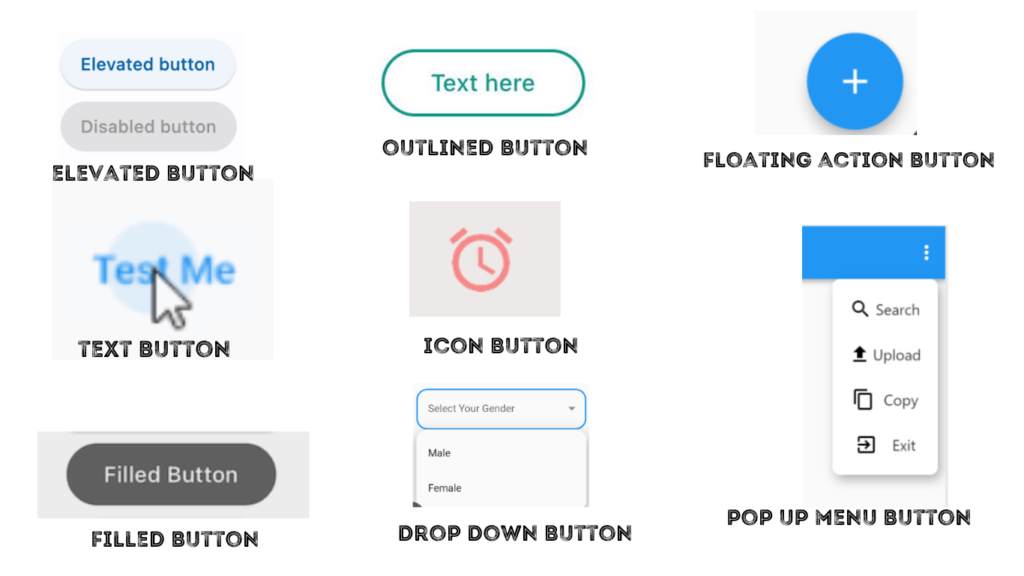
There are several kinds of buttons shown in Flutter:
- Elevated Button
- Outlined Button
- Text Button
- Floating action Button
- Icon Button
- Filled Button
- Drop-Down Button
- Pop-up menu Button
Different types of Flutter Button Packages:
There are also different types of Flutter Button Packages that help you make your button in your app more lucrative. Some of the top button packages are given below:
- group_button
- tap_debouncer
- nice_buttons
- timer_button
- pushable_button
- flutter_grid_button
- gradient_coloured_buttons
- pretty_animated_buttons
- async_button_builder
- flutter_animated_button
Flutter Built-in Button Explanation with Examples:
ELEVATED BUTTON:
Elevated Button is the most prevalent. It has just been a simple text with minimal customizations. The two most important properties are onPressed() and child. Its attributes, such as color and text size, can then be used to decorate it.
Example: (Just Run it on your favorite code editor.)
class ElevatedButtonExample extends StatefulWidget {
  const ElevatedButtonExample({super.key});

  @override
  State<ElevatedButtonExample> createState() => _ElevatedButtonExampleState();
}

class _ElevatedButtonExampleState extends State<ElevatedButtonExample> {
  @override
  Widget build(BuildContext context) {
    final ButtonStyle style =
        ElevatedButton.styleFrom(textStyle: const TextStyle(fontSize: 20));

    return Center(
      child: Column(
        mainAxisSize: MainAxisSize.min,
        children: <Widget>[
          ElevatedButton(
            style: style,
            onPressed: null,
            child: const Text('Disabled'),
          ),
          const SizedBox(height: 30),
          ElevatedButton(
            style: style,
            onPressed: () {},
            child: const Text('Enabled'),
          ),
        ],
      ),
    );
  }
}
OUTLINED BUTTON:
Outlined Button just has an outline and a child widget that has text, an icon, or other properties.
Example: (Just Run it on your favorite code editor.)
class OutlinedButtonExample extends StatelessWidget {
  const OutlinedButtonExample({super.key});

  @override
  Widget build(BuildContext context) {
    return OutlinedButton(
      onPressed: () {
        debugPrint('Received click');
      },
      child: const Text('Click Me'),
    );
  }
}
TEXT BUTTON:
To make Text Buttons noticeable, place them on toolbars, in dialog boxes, or inline with other content but with padding separating them from it.
Since text buttons lack visible borders, context for them must be inferred from their placement in relation to other content. They belong together in one of the bottom corners of dialogs and cards.
Do not use text buttons in the middle of lists or other areas where they would get lost in other content.
Example: (Just Run it on your favorite code editor.)
class TextButtonExample extends StatelessWidget {
  const TextButtonExample({super.key});

  @override
  Widget build(BuildContext context) {
    return Center(
      child: Column(
        mainAxisSize: MainAxisSize.min,
        children: <Widget>[
          TextButton(
            style: TextButton.styleFrom(
              textStyle: const TextStyle(fontSize: 20),
            ),
            onPressed: null,
            child: const Text('Disabled'),
          ),
          const SizedBox(height: 30),
          TextButton(
            style: TextButton.styleFrom(
              textStyle: const TextStyle(fontSize: 20),
            ),
            onPressed: () {},
            child: const Text('Enabled'),
          ),
          const SizedBox(height: 30),
          ClipRRect(
            borderRadius: BorderRadius.circular(4),
            child: Stack(
              children: <Widget>[
                Positioned.fill(
                  child: Container(
                    decoration: const BoxDecoration(
                      gradient: LinearGradient(
                        colors: <Color>[
                          Color(0xFF0D47A1),
                          Color(0xFF1976D2),
                          Color(0xFF42A5F5),
                        ],
                      ),
                    ),
                  ),
                ),
                TextButton(
                  style: TextButton.styleFrom(
                    foregroundColor: Colors.white,
                    padding: const EdgeInsets.all(16.0),
                    textStyle: const TextStyle(fontSize: 20),
                  ),
                  onPressed: () {},
                  child: const Text('Gradient'),
                ),
              ],
            ),
          ),
        ],
      ),
    );
  }
}
FLOATING ACTION BUTTON:
The Floating Action button‘s name gives you an idea of how it will behave on the screen: it will remain stationary regardless of how far you scroll. You can use it anywhere in your app. Usually, developers use it on the bottom left corner of the screen.
Example: (Just Run it on your favorite code editor.)
class FloatingActionButtonExample extends StatefulWidget {
  const FloatingActionButtonExample({super.key});

  @override
  State<FloatingActionButtonExample> createState() =>
      _FloatingActionButtonExampleState();
}

class _FloatingActionButtonExampleState
    extends State<FloatingActionButtonExample> {

static const List<(Color?, Color? background, ShapeBorder?)> customizations =
      <(Color?, Color?, ShapeBorder?)>[
(null, null, null), // The FAB uses its default for null parameters.
    (null, Colors.green, null),
    (Colors.white, Colors.green, null),
    (Colors.white, Colors.green, CircleBorder()),
  ];
int index = 0; // Selects the customization.

  @override
  Widget build(BuildContext context) {
    return Scaffold(
      appBar: AppBar(
        title: const Text('FloatingActionButton Sample'),
      ),
      body: const Center(child: Text('Press the button below!')),
      floatingActionButton: FloatingActionButton(
        onPressed: () {
          setState(() {
            index = (index + 1) % customizations.length;
          });
        },
        foregroundColor: customizations[index].$1,
        backgroundColor: customizations[index].$2,
        shape: customizations[index].$3,
        child: const Icon(Icons.navigation),
      ),
    );
  }
}
ICON BUTTON:
In this Icon Button, you can add an icon as the child of the button.
Example: (Just Run it on your favorite code editor.)
double _volume = 0.0;

class IconButtonExample extends StatefulWidget {
  const IconButtonExample({super.key});

  @override
  State<IconButtonExample> createState() => _IconButtonExampleState();
}

class _IconButtonExampleState extends State<IconButtonExample> {
  @override
  Widget build(BuildContext context) {
    return Column(
      mainAxisSize: MainAxisSize.min,
      children: <Widget>[
        IconButton(
          icon: const Icon (Icons.volume_up),
          tooltip: 'Increase volume by 10',
          onPressed: () {
            setState(() {
              _volume += 10;
            });
          },
        ),
        Text('Volume : $_volume'),
      ],
    );
  }
}
FILLED BUTTON:
After the floating action button, Filled Buttons have the greatest visual impact. They should be used for significant, concluding actions that finish a flow, such as Save, Join Now, or Confirm.
Example: (Just Run it on your favorite code editor.)
class FilledButtonApp extends StatelessWidget {
  const FilledButtonApp({super.key});

  @override
  Widget build(BuildContext context) {
    return MaterialApp(
      theme: ThemeData(
          colorSchemeSeed: const Color(0xff6750a4), useMaterial3: true),
      home: Scaffold(
        appBar: AppBar(title: const Text('FilledButton Sample')),
        body: Center(
          child: Row(
            mainAxisSize: MainAxisSize.min,
            children: <Widget>[
              Column(children: <Widget>[
                const SizedBox(height: 30),
                const Text('Filled'),
                const SizedBox(height: 15),
                FilledButton(
                  onPressed: () {},
                  child: const Text('Enabled'),
                ),
                const SizedBox(height: 30),
                const FilledButton(
                  onPressed: null,
                  child: Text('Disabled'),
                ),
              ]),
              const SizedBox(width: 30),
              Column(children: <Widget>[
                const SizedBox(height: 30),
                const Text('Filled tonal'),
                const SizedBox(height: 15),
                FilledButton.tonal(
                  onPressed: () {},
                  child: const Text('Enabled'),
                ),
                const SizedBox(height: 30),
                const FilledButton.tonal(
                  onPressed: null,
                  child: Text('Disabled'),
                ),
              ])
            ],
          ),
        ),
      ),
    );
  }
}
DROP DOWN BUTTON:
The user can choose from several options by using a drop-down menu. The button displays the item that is currently selected, along with an arrow that opens a menu to allow you to choose another item.
Example: (Just Run it on your favorite code editor.)
class DropdownButtonExample extends StatefulWidget {
  const DropdownButtonExample({super.key});

  @override
  State<DropdownButtonExample> createState() => _DropdownButtonExampleState();
}

class _DropdownButtonExampleState extends State<DropdownButtonExample> {
  String dropdownValue = list.first;

  @override
  Widget build(BuildContext context) {
    return DropdownButton<String>(
      value: dropdownValue,
      icon: const Icon(Icons.arrow_downward),
      elevation: 16,
      style: const TextStyle(color: Colors.deepPurple),
      underline: Container(
        height: 2,
        color: Colors.deepPurpleAccent,
      ),
      onChanged: (String? value) {
        This is called when the user selects an item.
        setState(() {
          dropdownValue = value!;
        });
      },
      items: list.map<DropdownMenuItem<String>>((String value) {
        return DropdownMenuItem<String>(
          value: value,
          child: Text(value),
        );
      }).toList(),
    );
  }
}
POP UP MENU BUTTON:
When a menu is pressed, it appears, and when an item is selected, the menu is dismissed and onSelected is called. The value of the selected menu item is passed to onSelected.
It is possible to give the icon or the child, but not both at once. A popup menu button functions similarly to an icon button if an icon is supplied.
Depending on the platform, a standard overflow icon is generated if both are null.
Example: (Just Run it on your favourite code editor.)
class PopupMenuExample extends StatefulWidget {
  const PopupMenuExample({super.key});

  @override
  State<PopupMenuExample> createState() => _PopupMenuExampleState();
}

class _PopupMenuExampleState extends State<PopupMenuExample> {
  SampleItem? selectedItem;

  @override
  Widget build(BuildContext context) {
    return Scaffold(
      appBar: AppBar(title: const Text('PopupMenuButton')),
      body: Center(
        child: PopupMenuButton<SampleItem>(
          initialValue: selectedItem,
          onSelected: (SampleItem item) {
            setState(() {
              selectedItem = item;
            });
          },
          itemBuilder: (BuildContext context) => <PopupMenuEntry<SampleItem>>[
            const PopupMenuItem<SampleItem>(
              value: SampleItem.itemOne,
              child: Text('Item 1'),
            ),
            const PopupMenuItem<SampleItem>(
              value: SampleItem.itemTwo,
              child: Text('Item 2'),
            ),
            const PopupMenuItem<SampleItem>(
              value: SampleItem.itemThree,
              child: Text('Item 3'),
            ),
          ],
        ),
      ),
    );
  }
}
Flutter Button Packages with Examples:
group_button:
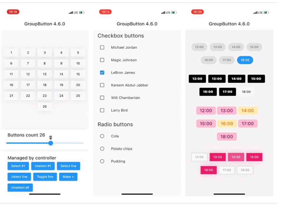
group_button is a very popular package with which we can create groups of buttons very easily. This package also has a ratio and checkbox buttons.
A simple example of a group button:
GroupButton(
    isRadio: false,
    onSelected: (index, isSelected) => print('$index button is selected'),
    buttons: ["12:00", "13:00", "14:30", "18:00", "19:00", "21:40"],
)
For more information, check the group_button package on pub.dev.
tap_debouncer:
Tap the debounce simplifying widget. When you wrap your button widget in a TapDebounce widget, taps will not be allowed while the tap callback is running.
If you wish to prevent users from repeatedly pressing the button to initiate additional SomeLongOperation functions. As an illustration, consider the Navigator pop function. It may require several hundred milliseconds to navigate, and if the user presses the button multiple times, the unwanted pop will occur several screens back rather than just once.
Simple example of tap_debouncer:
//...
child: TapDebouncer(
  cooldown: const Duration(milliseconds: 1000),
  onTap: () async => await someLongOperation(), // your tap handler moved here
  builder: (BuildContext context, TapDebouncerFunc? onTap) {
    return RaisedButton(
      color: Colors.blue,
      disabledColor: Colors.grey,
      onPressed: onTap,  // It is just a tap from builder callback
      child: const Text('Short'),
    );
  },
),
//...
For more information, check the tap_debouncer package on pub.dev.
nice_buttons:
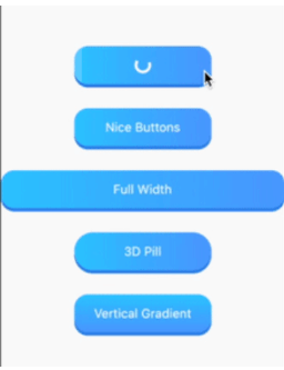
Nice_buttons is a stunning 3D button that can be customized, animated, and used in your Flutter project.
A simple example of a nice button:
NiceButtons(
  stretch: true,
  gradientOrientation: GradientOrientation.Horizontal,
  onTap: (finish) {
    print('On tap called');
  },
  child: Text(
    'Full Width',
    style: TextStyle(color: Colors.white, fontSize: 18),
  ),
);
For more information, check the nice_buttons package on pub.dev.
timer_button:
A flexible Flutter package that offers a timer button widget that activates after a predetermined amount of time.
A simple example of a timer button:
Default Timer Button:
   TimerButton(
                  label: "Try Again",
                  timeOutInSeconds: 5,
                  onPressed: () {
                    log("Time for some action!");
                  },
                ),

With TimerButton.builder: You can customize the button’s appearance by passing a builder function:
 TimerButton.builder(
                  builder: (context, timeLeft) {
                    return Text(
                      "Custom: $timeLeft",
                      style: const TextStyle(color: Colors.red),
                    );
                  },
                  onPressed: () {
                    log("Time for some action!");
                  },
                  timeOutInSeconds: 5,
                ),
For more information, check the timer_button package on pub.dev.
pushable_button:
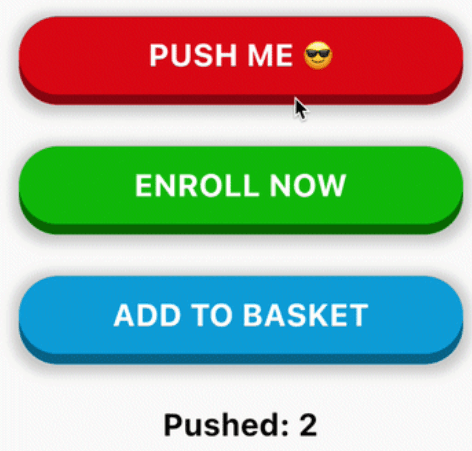
An interactive 3D button that is incorporated into Flutter. Ideal for important CTAs in the app./code
Simple Example of pushable_button:
PushableButton(
  child: Text('ENROLL NOW', style: someTextStyle),
  height: 60,
  elevation: 8,
  hslColor: HSLColor.fromAHSL(1.0, 120, 1.0, 0.37),
  shadow: BoxShadow(
    color: Colors.grey.withOpacity(0.5),
    spreadRadius: 5,
    blurRadius: 7,
    offset: Offset(0, 2),
  ),
  onPressed: () => print('Button Pressed!'),
)
For more information, check the pushable_button package on pub.dev.
flutter_grid_button :
A Flutter widget that creates a grid of buttons. It is helpful for creating a calculator, number pad, and other things.
Simple Example of flutter_grid_button:
GridButton(
  onPressed: (String value) {
    /*...*/
  },
  items: [
    [
      GridButtonItem(title: "1"),
      GridButtonItem(child: Text("2")),
      GridButtonItem(title: "3", flex: 2),
    ],
    [
      GridButtonItem(title: "a", value: "100", longPressValue: "long"),
      GridButtonItem(title: "b", color: Colors.lightBlue)
    ],
  ],
)
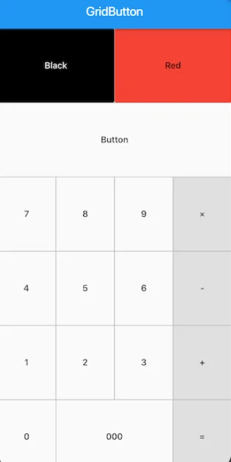
For more information, check the flutter_grid_button package on pub.dev.
gradient_coloured_buttons:
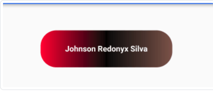
A Flutter package that provides customizable buttons with gradient colors. Enhance your Flutter UI by easily creating buttons with smooth gradient backgrounds.
Simple example of gradient-coloured buttons:
  GradientButton(
              text: "Johnson Redonyx Silva",
              textStyle: TextStyle(fontWeight: FontWeight.bold,fontSize: 15),
              gradientColors: [Colors.red,Colors.black,Colors.brown],
              width: 200,
              height: 50,
              borderRadius: 30.0,
              onPressed: ()
              {
                print("GradientButton is Pressed");
              }
          ),
For more information, check the gradient_coloured_buttons package on pub.dev.
pretty_animated_buttons:
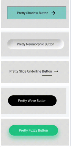
The selection of lovely animated buttons in the Pretty Animated Buttons bundle is also quite customizable. There are presently 12 animated buttons accessible.
Simple Example of pretty_animated_button:
  PrettyShadowButton(
      label: "Pretty Shadow Button",
      onPressed: () {},
      icon: Icons.arrow_forward,
      shadowColor: Colors.green,
    ),
For more information, check the pretty_animated_buttons package on pub.dev.
async_button_builder:
AsyncButtonBuilder allows you to easily add an asynchronous feature to any form of button. It allows you to add loading, disabled, errored, and completed states (with fluid animations in between) to buttons that do asynchronous activities.
Example of async_button_builder:
AsyncButtonBuilder(
  child: Text('Click Me'),
  onPressed: () async {
    await Future.delayed(Duration(seconds: 1));
  },
  builder: (context, child, callback, _) {
    return TextButton(
      child: child,
      onPressed: callback,
    );
  },

For more information, check the async_button_builder package on pub.dev.
flutter_animated_button:
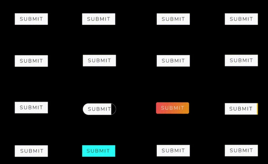
This pacakge is my favourite pacakge to animate a button in my flutter app. It makes my app’s user interface very cool and eye catching.
Simple Example of flutter_animated_button:
 AnimatedButton(
                width: 200,
                text: 'SUBMIT',
                selectedTextColor: Colors.black,
                transitionType: TransitionType.BOTTOM_TO_TOP,
                textStyle: TextStyle(
                    fontSize: 28,
                    letterSpacing: 5,
                    color: Colors.deepOrange,
                    fontWeight: FontWeight.w300),
              )
For more information, check the flutter_animated_button package on pub.dev.
FAQs:
1. Can I use multiple types of buttons in my Flutter app?
Yes, Flutter allows you to use multiple types of buttons based on your app’s requirements. You can mix and match built-in buttons like ElevatedButton, OutlinedButton, TextButton, and more, or utilize specialized button packages for specific functionalities.
2. How can I customize the appearance of buttons in Flutter?
Flutter provides various properties and styles to customize button appearance, such as color, text size, shape, padding, and more. Additionally, specialized packages offer even more customization options like gradient colors, animations, and 3D effects.
3. Are there any packages available for creating button groups or grids in Flutter?
Yes, there are several Flutter packages available for creating button groups, grids, and other specialized button functionalities. Packages like group_button, flutter_grid_button, and tap_debouncer offer solutions for creating button layouts tailored to your app’s needs.
4. Which type of button should I use for important actions in my Flutter app?
For significant actions that conclude a flow or require attention, consider using buttons like ElevatedButton or FilledButton, which have a strong visual impact. These buttons are suitable for actions like Save, Join Now, or Confirm.
5. How do I handle asynchronous actions with buttons in Flutter?
Flutter provides packages like async_button_builder, which allow you to easily add asynchronous features to buttons. These packages enable you to handle loading, disabled, errored, and completed states with fluid animations for buttons performing asynchronous activities.
Conclusion:
In conclusion, buttons are essential components of any Flutter app, providing users with interactive elements to trigger actions and navigate through the application. Flutter offers a diverse range of built-in buttons with customizable properties, allowing developers to create buttons tailored to their app’s design and functionality.
Check out – Add Simple Animation in Flutter

