Hey Flutter Devs, you know flutter is our crush and a popular framework for building beautiful, natively compiled applications for mobile, web, and desktop from a single codebase. It can make our dream app so hot and crispy. One of the main strengths of Flutter is its extensive range of libraries, one of which is fl chart, a powerful tool for creating beautiful and stunning charts.
In this article, we will explore how to use fl chart to create beautiful charts in Flutter. It is a comprehensive guide to mastering Flutter data visualization.
Whether you’re a beginner or an experienced developer, this guide will help you enhance your data visualization skills and create stunning visual representations of your data.
Table of Contents
Understanding the fl chart library
With fl_chart tutorial, you can easily get started with implementing custom charts in Flutter. By using custom charts in Flutter, you can effectively convey complex data insights to your users and enhance the overall user experience. This tutorial will guide you through the process of integrating the fl_chart library into your project and creating your first chart from scratch.
Benefits of Using fl chart for Data Visualization
Seamless integration with Flutter applications
There are a wide variety of chart types to choose from
Highly customizable charts for unique data visualization needs
Smooth animations for interactive user experience
Built-in support for data labels, legends, and tooltips
By utilizing the fl_chart library, developers can create visually appealing and interactive charts that enhance the overall look and feel of their Flutter applications.
Getting Started with fl chart
					dependencies:
  fl_chart: ^0.68.0
Now run flutter pub get to install the dependency into your project.
Now that we have fl_chart set up, let’s create some beautiful charts!
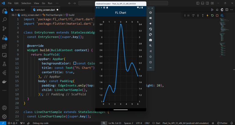
Creating a Line Chart
Line charts are like the reliable friend who always shows up. They’re simple, yet incredibly useful. Here’s how you can create a basic line chart with fl_chart.
					class LineChartSample extends StatelessWidget {
  const LineChartSample({super.key});

  @override
  Widget build(BuildContext context) {
    return LineChart(
      LineChartData(
        gridData: const FlGridData(show: true),
        titlesData: const FlTitlesData(show: true),
        borderData: FlBorderData(show: true),
        lineBarsData: [
          LineChartBarData(
            spots: [
              const FlSpot(0, 1),
              const FlSpot(1, 1.5),
              const FlSpot(2, 1.4),
              const FlSpot(3, 3.4),
              const FlSpot(4, 2),
              const FlSpot(5, 2.2),
              const FlSpot(6, 1.8),
            ],
            isCurved: true,
            color: Colors.blue,
            barWidth: 4,
            belowBarData: BarAreaData(show: false),
          ),
        ],
        lineTouchData: LineTouchData(
          touchTooltipData: LineTouchTooltipData(
            getTooltipColor: (touchedSpot) => Colors.blueAccent,
          ),
          touchCallback: (FlTouchEvent event, LineTouchResponse? response) {
            if (!event.isInterestedForInteractions ||
                response == null ||
                response.lineBarSpots == null) {
              return;
            }
            // Handle touch events here
          },
          handleBuiltInTouches: true,
        ),
      ),
    );
  }
}
This code sets up a simple line chart. The Flspot class is used to define the data points, and you can customize the chart’s appearance by tweaking properties like isCurved, Color, and barwidth.
fl_chart also allows you to add interactivity to your charts with gestures and touch events. It has a lineTouchData property, which has a class LineTouchData. You can make your line chart interactive. That means when the user touches the chart, it will dance like me. (By the way, I am a good dancer.)
Output:
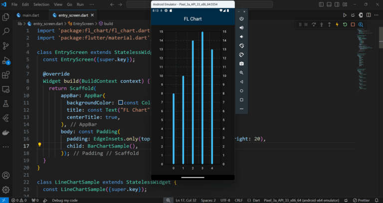
Creating a Bar Chart
Bar charts are the life of the party. They’re bold, they’re colorful, and they make your data look good. Here’s how to create one:
					class BarChartSample extends StatelessWidget {
  const BarChartSample({super.key});

  @override
  Widget build(BuildContext context) {
    return BarChart(
      BarChartData(
        barGroups: [
          BarChartGroupData(
            x: 0,
            barRods: [
              BarChartRodData(
                toY: 8,
                color: Colors.lightBlueAccent,
              )
            ],
          ),
          BarChartGroupData(
            x: 1,
            barRods: [
              BarChartRodData(
                toY: 10,
                color: Colors.lightBlueAccent,
              )
            ],
          ),
          BarChartGroupData(
            x: 2,
            barRods: [
              BarChartRodData(
                toY: 14,
                color: Colors.lightBlueAccent,
              )
            ],
          ),
          BarChartGroupData(
            x: 3,
            barRods: [
              BarChartRodData(
                toY: 15,
                color: Colors.lightBlueAccent,
              )
            ],
          ),
          BarChartGroupData(
            x: 4,
            barRods: [
              BarChartRodData(
                toY: 13,
                color: Colors.lightBlueAccent,
              )
            ],
          ),
        ],
        barTouchData: BarTouchData(
          touchTooltipData: BarTouchTooltipData(
            getTooltipColor: (barTouchTooltipData) => Colors.blueAccent,
          ),
          touchCallback: (FlTouchEvent event, BarTouchResponse? response) {
            if (!event.isInterestedForInteractions ||
                response == null ||
                response.spot == null) {
              return;
            }
            // Handle touch events here
          },
          handleBuiltInTouches: true,
        ),
      ),
    );
  }
}
This snippet creates a vibrant bar chart. The BarChartGroupData class helps to group bars together, and you can customize the colors to make your chart pop.
>> Check out more flutter blogs here
Output:
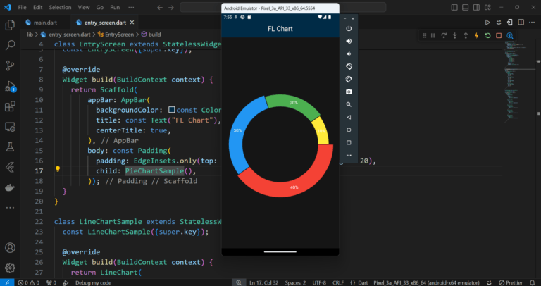
Creating a Pie Chart
Pie charts are the dessert of the chart world. They’re visually appealing and everyone loves them. Here’s how to whip up a delicious pie chart with fl chart:
					class PieChartSample extends StatelessWidget {
  const PieChartSample({super.key});

  @override
  Widget build(BuildContext context) {
    return PieChart(
      PieChartData(
        sections: [
          PieChartSectionData(
            color: Colors.red,
            value: 40,
            title: '40%',
            radius: 50,
          ),
          PieChartSectionData(
            color: Colors.blue,
            value: 30,
            title: '30%',
            radius: 45,
          ),
          PieChartSectionData(
            color: Colors.green,
            value: 20,
            title: '20%',
            radius: 40,
          ),
          PieChartSectionData(
            color: Colors.yellow,
            value: 10,
            title: '10%',
            radius: 35,
          ),
        ],
        pieTouchData: PieTouchData(
          touchCallback: (FlTouchEvent event, PieTouchResponse? response) {
            if (!event.isInterestedForInteractions ||
                response == null ||
                response.touchedSection == null) {
              return;
            }
            // Handle touch events here
          },
        ),
      ),
    );
  }
}
This code creates a colorful pie chart. Each PieChartSectionData object represents a slice of the pie. You can customize the color, value, title, and radius of each slice to suit your needs.
Output:
Best Practices for Implementing Flutter Charts
When implementing Flutter charts in your applications, consider the following best practices:
Choose the right chart type that best represents your data.
Keep the design clean and minimalistic for better readability.
Use colors and labels effectively to highlight key data points.
Test the chart on different screen sizes for optimal display.
Leverage animations to create engaging visualizations.
By following these best practices, you can ensure that your Flutter charts are both visually appealing and informative for your users.
Real-World Examples of Flutter Chart Implementations
Here are some real-world examples of Flutter chart implementations that demonstrate the versatility and effectiveness of custom charts in Flutter:
Stock market price trends displayed in a line chart with interactive tooltips.
Monthly sales performance visualized in a bar chart with data labels for each bar.
Weather forecast data presented in a radar chart with smooth animations for a detailed view.
User engagement metrics represented in a scatter plot with colorful markers for different data points.
Wrapping Up
Remember, the key to effective data visualization is choosing the right chart library for your Flutter applications. With the fl chart library, you can create custom charts that perfectly represent your data and engage your users. Start incorporating Flutter charts into your applications today and elevate your data visualization skills!